Haven — UX/UI Case Study
A health companion super app to reduce cognitive load in medication and appointment management.
Introduction
Living with a chronic health condition is already demanding. Adapting to the fast evolving technology world and an increasingly digital healthcare environment can make it even more difficult, particularly for individuals who are not tech-savvy. As more health-related services transition to mobile applications, accessibility and usability become more important. Many existing healthcare apps are overly complex, information-heavy, and unintuitive, which leaves its users overwhelmed rather than supported.
Clearly, there is a need for a user-centered solution that simplifies medication management and doctor/patient communication while remaining accessible to users of all technological backgrounds.
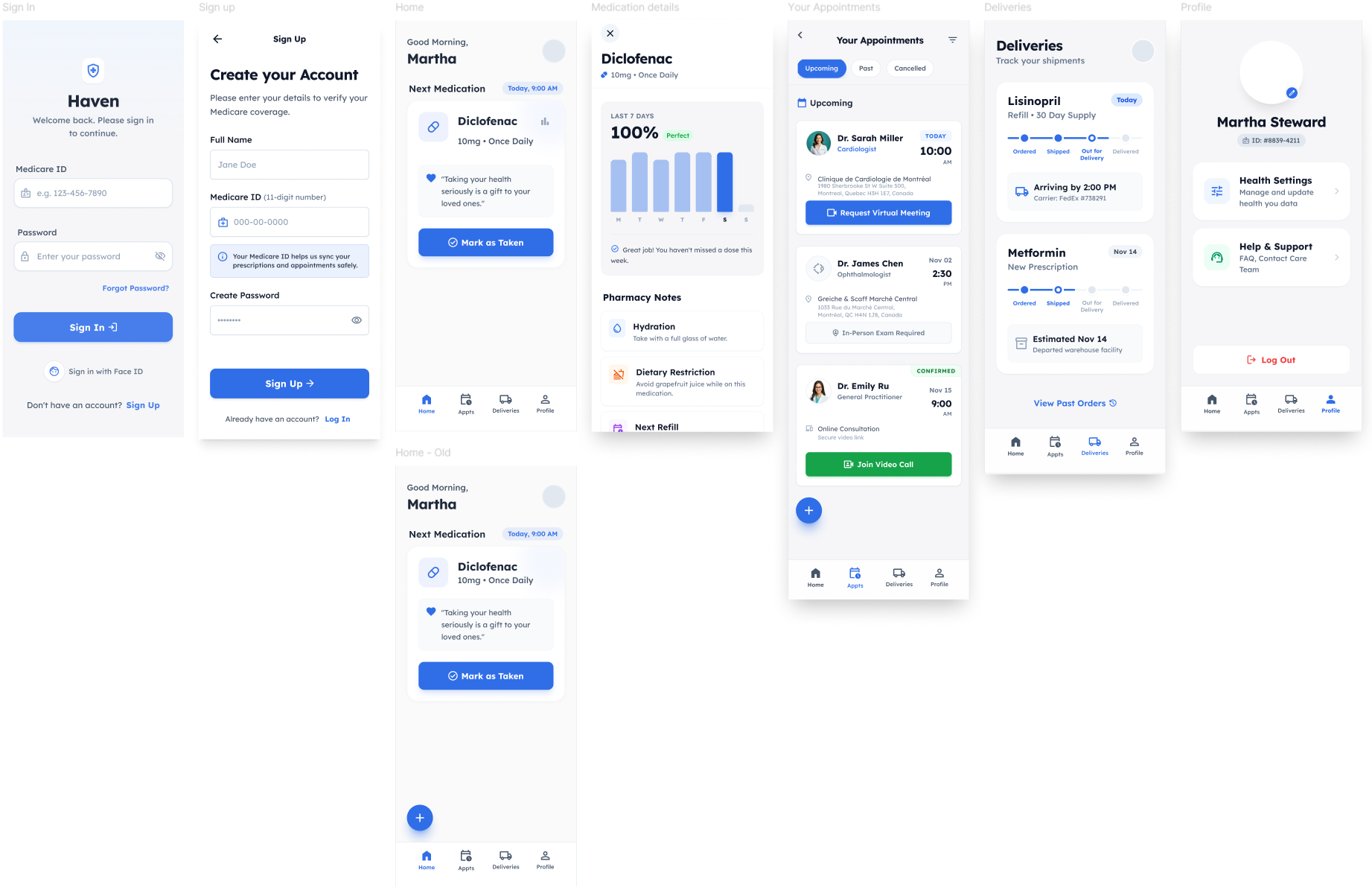
Haven was designed to reduce the cognitive load associated with managing chronic health conditions. The application provides a medication reminders, medication tracking, appointment scheduling, virtual appointments and medication delivery services all within a minimalist and accessible interface.
The Problem
Health is one of the most important aspects of life, yet managing it often feels unnecessarily complicated. Medication non-adherence remains one of the most preventable causes of health deterioration. Patients frequently miss doses due to forgetfulness, complex medication schedules, or fragmented communication between healthcare providers.
The healthcare system itself does not always simplify this process. Patients may receive different information from pharmacists than what their doctor originally said. Appointments, prescriptions, and medication instructions are often managed across multiple systems which leaves room for error.
Based On Real User Needs
Prior to the design phase, a survey was conducted targeting potential beta users and people who wanted to share their thoughts on the matter. The initial goal was to collect at least 30 responses to ensure a diverse range of perspectives. Ultimately, 43 individuals participated in the survey.
What the survey says: View Full Survey (Google Form)
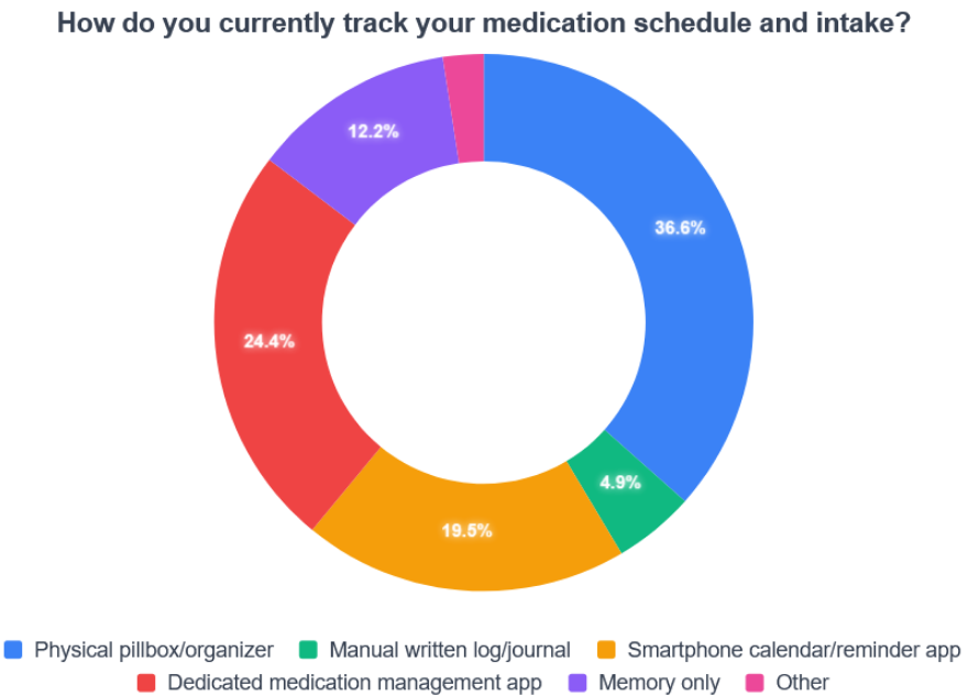
More than one-third of respondents reported using a pillbox to manage their medications. However, more than half stated they do not use a system that actively reminds them to take their medication.
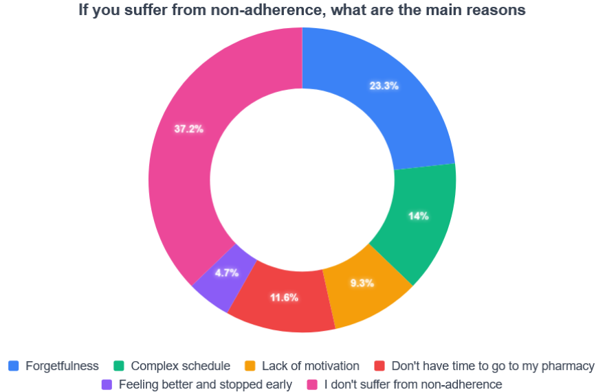
Additionally, nearly a quarter of respondents identified forgetfulness as their primary reason for medication non-adherence.
This finding hints that the integration of push notifications within the app should be added. As a result, Haven includes customizable medication reminders designed to minimize missed doses. For the 9% of respondents who cited lack of motivation as a factor, we have decided to add something special as it might benefit everyone. Notifications include brief inspirational messages or quotes to encourage them to stay consistent.
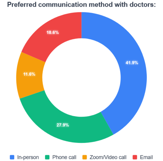
Although "in-person" appointments received the highest number of votes individually, it was also the only synchronous option presented. When combining the asynchronous options, more than half of respondents expressed that they prefer a virtual communication methods.
This insight led us to integrate flexible appointments. Within Haven, users can:
- Schedule appointments
- View appointment details
- Request virtual consultations
If an in-person examination is required, the virtual option will not be available. This approach balances flexibility and practicality.
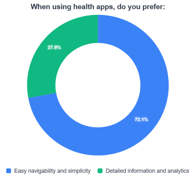
When asked whether they prefer a simple and easy to navigate health applications or one that has a lot of detailed information, the majority favored simplicity.
This insight influenced the visual design of Haven. The application has a minimalist interface. However, for users who prefer additional health information, expanded details can be toggled on within settings.
This ensures that the app remains approachable for less tech-savy users while still accommodating information-oriented individuals.
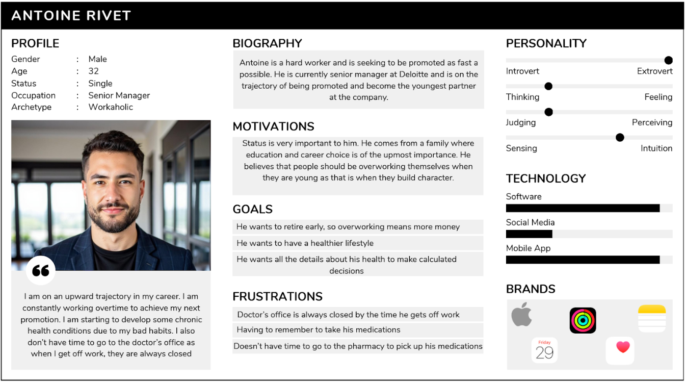
Personas
Based on survey insights, two primary personas were developed to represent the main user groups.
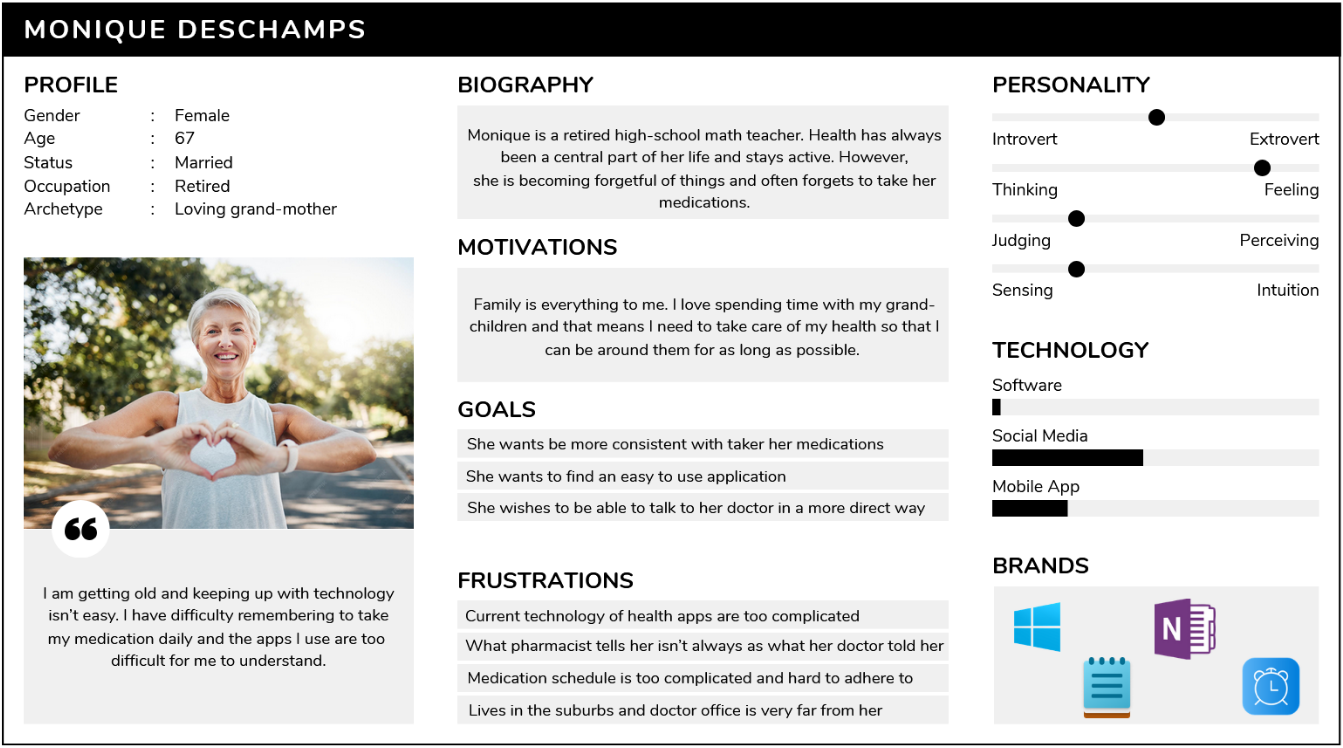
Because chronic health conditions are more prevalent among older populations, accessibility was a central design priority. Haven features simplistic typography and minimal visual clutter. At the same time, the interface allows users to toggle additional information if desired, ensuring flexibility without sacrificing simplicity.
Recognizing that commuting to a doctor's office can be inconvenient or physically difficult, Haven allows users to attend appointments virtually if possible. Once an appointment is booked, users may request a virtual format if the consultation type allows it. This feature enhances accessibility without replacing necessary in-person examinations.
Managing chronic conditions can be emotionally exhausting. Complex medication schedules can reduce motivation and consistency. To support users, push notifications comes with short motivational messages to reinforce positive health behaviors.
User Journey
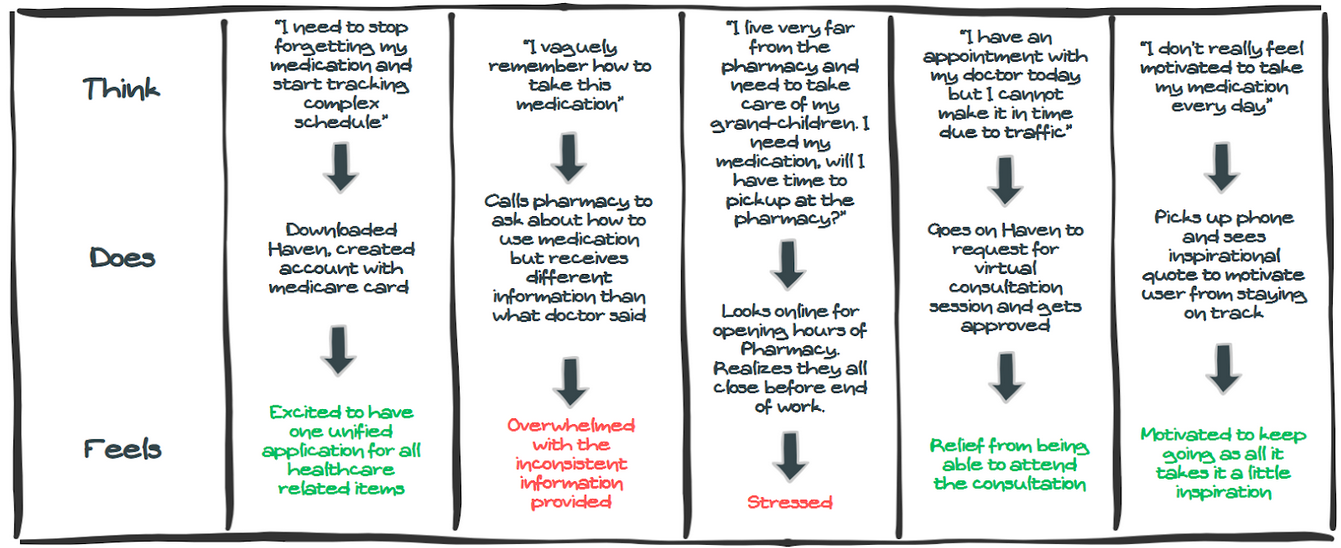
The user journey map for a representative user, Monique Deschamps, revealed several critical pain points:
- Difficulty commuting to medical appointments
- Challenges retrieving medication from pharmacies
- Confusion caused by fragmented communication between providers
- Overwhelm due to complex medication schedules
The Journey Key Takeaways
- Not all users can physically attend medical appointments. Haven supports virtual consultations when possible.
- Haven includes a medication delivery feature that allows prescriptions to be delivered directly to the user's home.
- Communication gaps between doctors, pharmacists, and patients increase confusion. Haven aims to centralize health-related information within one unified platform. By integrating with the government's healthcare identification system, users can access medication and appointment information.
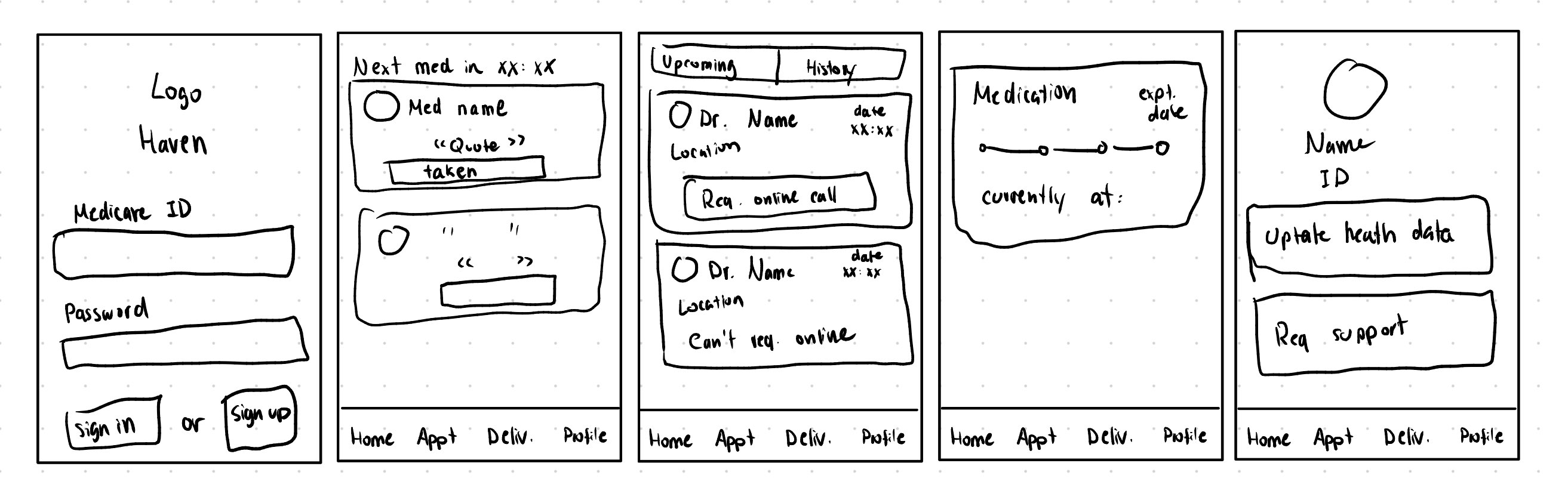
Wireframing and Prototype Design
Wireframes
Figma Mockups & Clickable Prototype
Testing
Usability testing was conducted to validate whether Haven is intuitive, accessible, and easy to navigate for users regardless of their technological background.
The objective was not only to confirm that features function correctly, but to ensure that users can successfully complete essential tasks without confusion or cognitive overload.
Goal: The goal of the usability test is to validate if all features are working as intended as well as if our app is easy enough to use for people regardless of their technological background.
Participants: Other UI/UX designers, at least 2 person per persona type, family and friends
Tasks
- Test if our unique medicare ID successfully pull all our medical information for the registration process
- Test if "Forgot Password" sends a password reset email
- Test if user can successfully sign in
- Test if the current list of medications is properly pulled from the medicare database
- Test if user can add their own medications
- Test if notifications are being pushed when the medication should be taken
- Test if user has the option to request a virtual meeting
- Test if user is able to join a virtual appointment call
- Test if user is forced to take an in-person appointment and cannot request a virtual meeting
- Test if user will be able to book extra appointments from the app
- Test if the delivery is up to date with tracking
- Test if the user received notification when a package is out for delivery to them so they can prepare
- Test if user is able to modify their health data if ever needed
- Test if user is able to contact support or read FAQs
We will be gather live feedback on users testing the app infront of us as well as recordings of submitted bugs.
Updated Based on Feedback
Thanks to the generous feedback from our beta testers, friends and family, we have made some changes along the way. Here is an example of a major change that led to an additional feature.
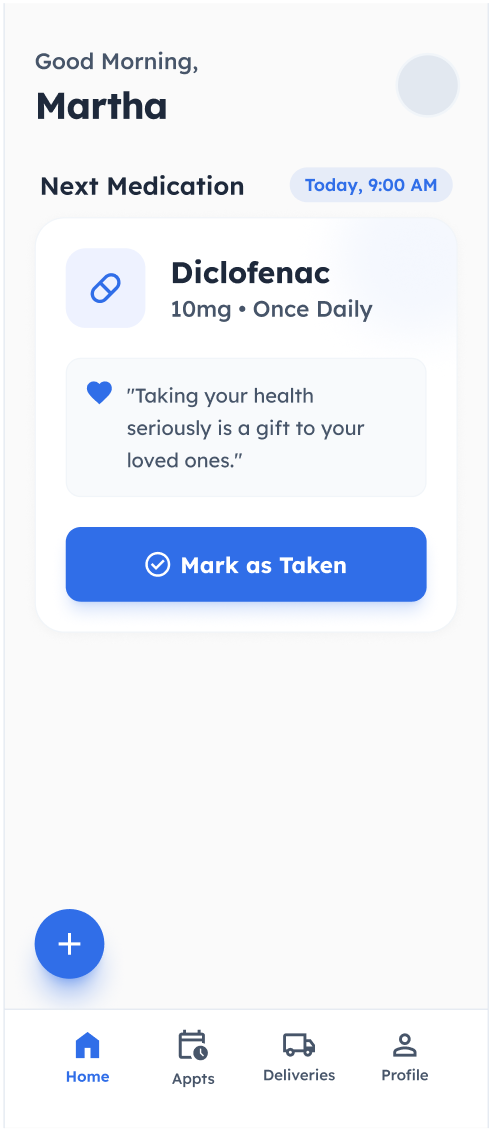
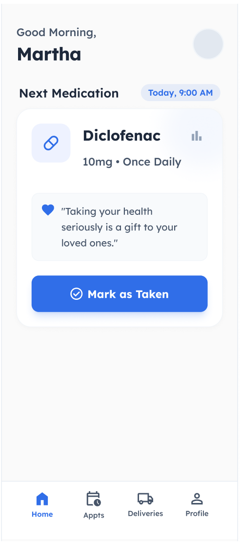
While we understand that most people enjoy an intuitive and minimalist application, when it comes to health, some information are very important and some users might require such extra information. Hence we have added an additional button that allows the user to view more details about their medication.
Reflection
Designing Haven was an opportunity to experiment how thoughtful UX design can have a meaningful impact on healthcare management. Throughout this project, we have learned that the process of developing an UX need to be based on research, user behavior, and iterative testing.
One of the most valuable lessons from this project was understanding that healthcare design is not about adding more information, it is about reducing confusion and clutter. Early in the process, it was tempting to incorporate extensive health analytics, detailed dashboards, and multiple tracking tools. However, research and survey results told us that simplicity is king for most users. Users did not want complexity, instead they wanted clarity.
This shift in mindset fundamentally shaped the product direction. Haven evolved from a potentially feature-heavy health app into a minimalist, action-oriented app that prioritizes essential tasks such as logging medication, viewing upcoming appointments, and communicating efficiently with doctors.
Another key insight was the emotional connection to users. Medication non-adherence can be seen as simply forgetfullness, but usability testing revealed that friction, overwhelm, and confusion are major contributors. By focusing on supportive language and simple interactions, the design aims to reduce anxiety.
The Challenges
One of the primary challenges during this project was the limitation of conducting research without direct access to healthcare professionals and a larger population of chronic care patients. While survey responses provided valuable insight, broader participation would have given more valuable insights.
To mitigate this limitation, secondary research conducted. Analyses of existing healthcare applications were used to validate and add to survey findings. Rather than attempting to simulate a fully integrated healthcare system, the project prioritized validating core interactions such as medication logging, appointment scheduling, and information accessibility. This approach ensured that, despite limited access to healthcare professionals, the design decisions remained evidence-based and user-centered.